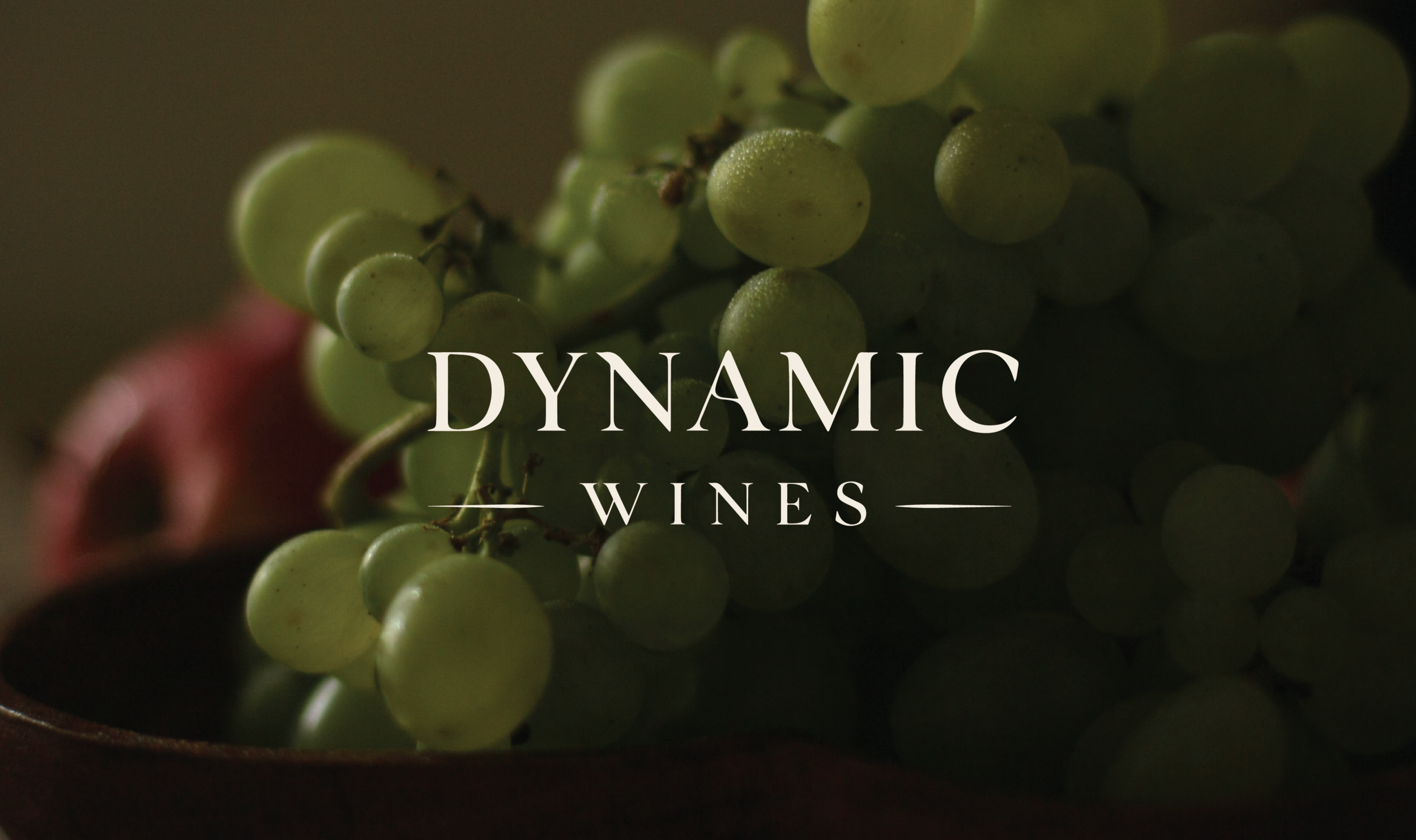
Dynamic Wines
This brand logo uses the serif typeface ‘BIGLLIA’ to communicate the idea of fluidity and rhythm. The choice of an older serif typeface appropriately references the traditional aspects within the winemaking process, as the brands identity is very much about keeping to their roots and respecting the generations of families that have created or inspired the wines they now sell. The earthy, natural colour palette references the Biodynamic nature of their wines, which is also what the brand name is inspired by.
Currently, I’m a Junior Designer for Dynamic Wines and have been working on finalising their new brand identity this month. Creating content for their website and emails were a key part of my design role in the past, however the layout and visuals have shifted since confirming the new style guide and brand identity which can be seen below.


